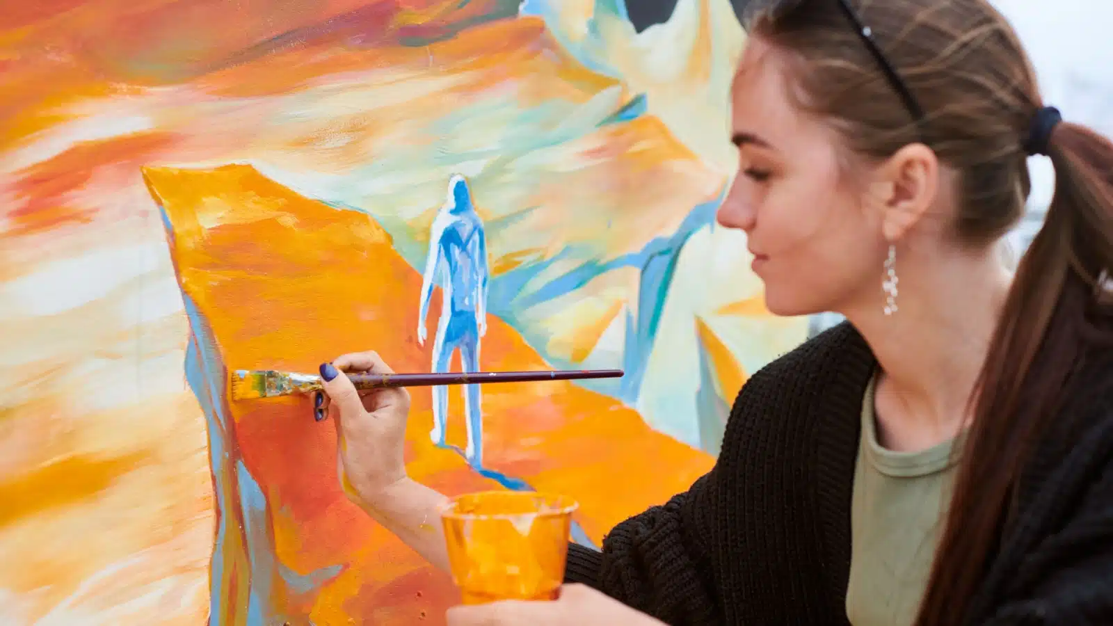
What colors make orange?
Red and yellow make orange.
Red and yellow are primary colors. Orange is a secondary color. When you mix pure shades of the primaries, you’ll get a brilliant, pure secondary.
How mundane.
The secret behind color theory is that nobody wants flawless synthetic orange. Simply mixing primary red and yellow ignores the vast playground of color which includes hundreds, if not thousands, of shades of oranges.
Artists create fantastical expanses of color ranging from cool red oranges to warm yellow oranges, subdued, almost imperceptible oranges to bright, brilliant oranges.
Join them with this quick and easy look at color theory using mixing orange as an example.
Watch the video for some examples of the different shades of oranges!
Why Color Theory Matters
Learning color theory is critical for artists who are serious about their craft. It’s not just about mixing two colors to get another. It’s a system that lets you predict how your color scheme will harmonize with itself, allowing you to plan that harmony in your works.
Considering your color scheme in advance will help you create a successful image before ever making that first brushstroke.
Let’s explore color theory using orange as an example and fully answer the question, “What colors make orange?”
Hey folks! Transparency Disclosure- Some of the links in this article are affiliate links. That means I’ll receive a small commission if you decide to click on it and buy something. Don’t worry, it doesn’t cost you anything extra!
How to Mix a Variety of Oranges

Every yellow and red pigment has different qualities, allowing an endless spectrum of orange mixtures.
Experiment with these mixtures.
Try adding more red to one and more yellow to another to see the range of red oranges and yellow oranges you can create with just these two colors.
Next, add a dab of white to all your mixtures to test how the color behaves as it cools and grows lighter. Note the fantastic array of colors you’ve created with these three pigments alone.
Using Tinting to Get the Perfect Orange

Now that you understand the basics, it’s time to produce an even greater spectrum of oranges with shading and tinting.
Artists accomplish this by choosing the correct pigment before starting a project.
Some pigments are transparent, and some are opaque. For the brightest orange, try mixing an opaque yellow with a transparent red (or vice versa). Combine lemon yellow or cadmium with Alizarin crimson or transparent red oxide.
Alternatively, if you’re interested in a more naturalistic piece, you can substitute the bright reds and yellows for earth tones. Consider the earthy, warm Venetian Red by Winsor & Newton or its counterpart Yellow Ochre for a pre-made orangish-yellow.
Earthtones make breathtaking colors ideal for a landscape or portrait. Although they may lack the brilliance of sunset orange, it’s important to remember that a painting’s beauty lies in the artistry of subdued colors more often than in bold, striking contrasts.
Remember that you don’t have to mix every color from the perfect primary blends of red, yellow, and blue. Various pre-made mixes are available across the spectrum of tones and may be an ideal starting point, depending on what you are painting.
What Colors Make Orange Neutral?
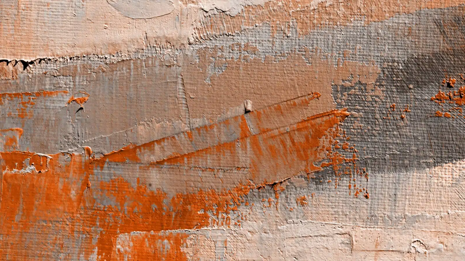
Have you noticed the phenomenon where it’s sometimes difficult to tell what color you’re looking at? It might be orangish gray, bluish-gray, or grayish blue. If you’ve experienced this, you’ve encountered a neutral color.
Neutrals make brilliant color possible. Though you can paint without them, you might find that when you create color-neutral combinations in your paintings by accident, they add a sense of atmosphere that bright colors can’t produce on their own.
You can create a neutral color by adding the opposite on the color wheel, known as the complementary color, to a mixture.
Red and green, yellow and purple, and blue and orange are complementary. Artists mix complementary pigments to neutralize them.
For instance, you can combine blue and brown to make a chromatic black because brown is a very dark shade of orange. When you mix the dark orange and dark blue, they neutralize each other. The result is the absence of color, which appears black.
Painters make black from Ultramarine Blue and Burnt Umber. Next, they combine various parts of their black mixture with different amounts of white to create a gray tonal scale. Using blue and brown for your black is advantageous because you can use a little more brown to make the resulting mixtures warmer or add more blue to make the resulting mixtures cooler.
This same process also creates a dull orange. If you add blue to orange, but not enough to neutralize it completely, you can still tell it was orange, but it won’t be as vibrant.
Artists employ this method to tone down certain aspects of a piece.
What Colors Make Orange Look Good?
The next step to exploring color theory in art is to make your painting realistic. Although a perfect orange offers an unmatched brilliance and can make your masterpiece stand out, it’s often not realistically found in nature.
Mixing realistic colors is vital when depicting a still life or landscape scene. Most oranges in nature aren’t brilliant, so combining the correct shades will ensure your oranges look true to life.
For example, imagine that you’re painting an actual orange. The fruit rests on the table, with light from the window shining on one side. The off-center lighting gives the orange sphere a crescent-shaped darkened side that casts an elongated shadow on the table.

The light side of the fruit showcases the brilliant orange color sharing its name, but consider the shadows.
How would you describe the orange in the shadows?
The color will vary slightly based on your light source and the color of the table, but those slight variations don’t impact the tried and true method of painting a cohesive and color-true spherical orange.
Add blue.
A tiny dab of blue will neutralize the brightness of the orange, just like the color appears neutralized in the orange’s shadow area.
Getting the Mixture Right
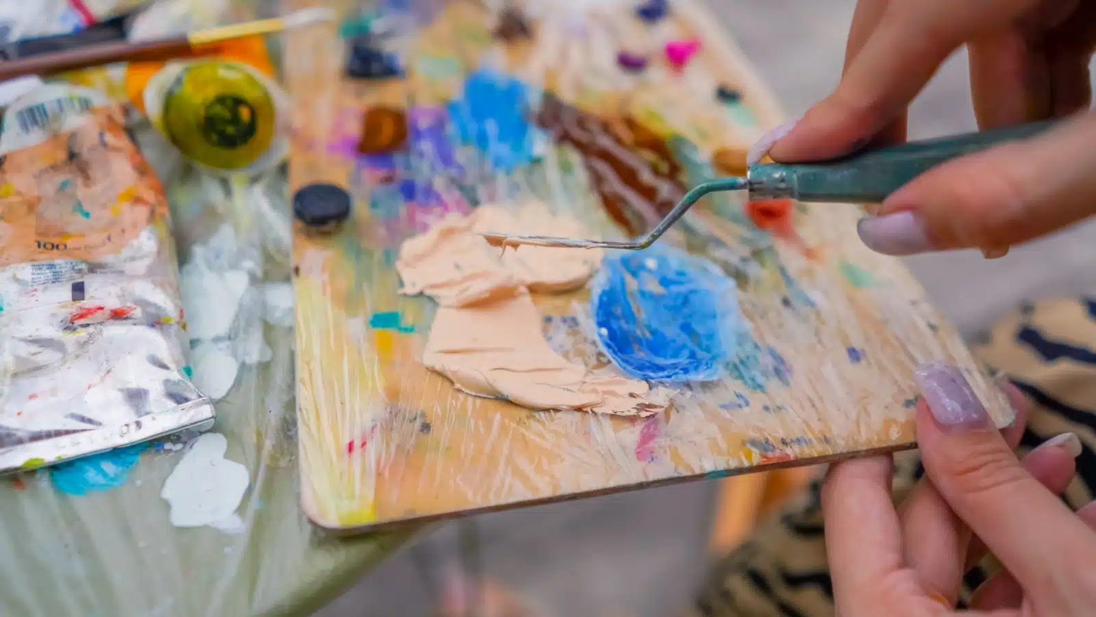
Getting your neutral mixture JUST right takes some tweaking and exploration, but the results are well worth it. The truth is that most oranges in nature aren’t the perfect, bright orange you achieve when you mix red and yellow. Most are toned down with shades of blue.
It’s also important to remember that different props require different mixtures and color schemes. For example, the red-orange color will impact your neutral if you use a blood orange instead of the traditional fruit.
You will have to shift your compliment.
Since your light color shifts toward red, your compliment will shift naturally toward green. Memorizing the color wheel is essential, but until you do, keep one nearby to ensure your intuitions are correct.
Using Color Harmonies to Establish a Solid Foundation
You can easily pre-plan your color harmonies by looking at the color of your subject(s) and finding that color’s complement. Remember that you must treat each object a little differently.
If you’re painting a woman with red hair wearing a blue hat, you will treat all three main color masses differently. The neutral will always be opposite your main color on the color wheel. There are only a few to memorize: Blue-Orange, Yellow-Purple, and Red-Green.
Color and Value Are Both Relative
The basics of color theory are just the beginning. Subtle intricacies arise based on the relative nature of color and value.
Orange will seem more orange when your image has blue in it than it would if surrounded by green or yellow. The same applies to the other color harmonies as well. A complimentary color can provide a much-needed “pop” for the primary color.
To make the most of this stunning relationship in a painting, use your overall light color to establish a unified color harmony. It’s not as complicated or confusing as it seems.
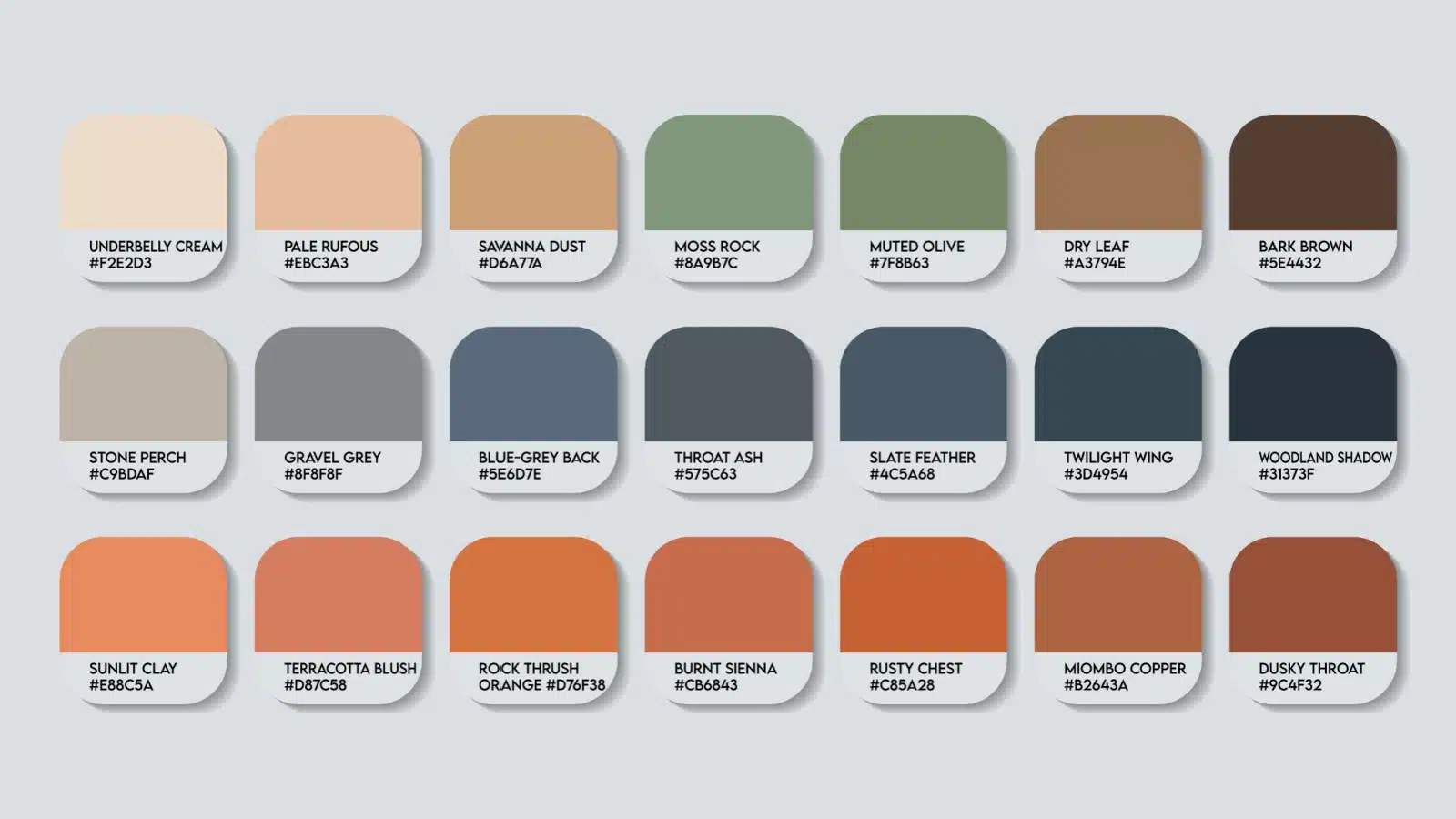
Block your shadows in with a complementing color, even if that means neutralizing a bit of your light color to turn the form.
In the example of an orange on the table, you’d use blue for your shadows to make the orange pop. Remember that the paint is capable of much more subtlety than can be shown in a photo. Use your knowledge of light/shadow relationships to build up to the saturated orange color prominent in the light using a gradient of value-based neutrals.
Eyes crave bold, brilliant, lush, highly saturated colors. The viewer’s eye will naturally be drawn to the boldest part of the canvas. Paint your whole orange in neutral colors, but leave a spot with pure orange to draw the viewer’s attention.
The tension created by the neutral’s flow will be satisfied by giving the eye the vivid burst of color saturation it desires. Only fellow artists will understand why your orange still-life painting is so compelling.
Understanding Color Theory
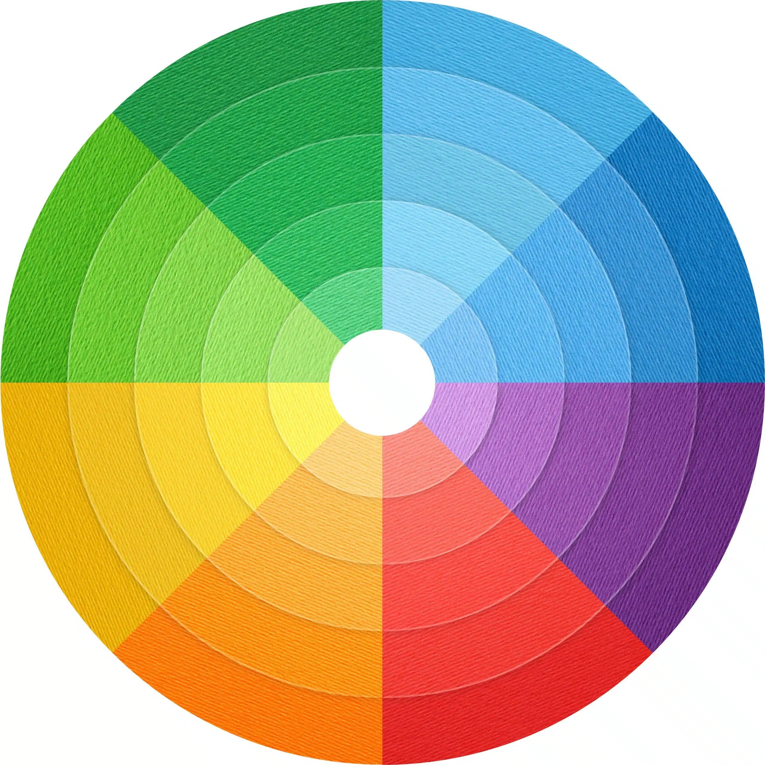
Color theory isn’t as simple as asking, “What colors make orange?” and mixing the two primary colors. There are millions of shades of orange.
Understanding color theory will help you mix the perfect tone for your piece.
This brief introduction is enough to get you started, but if you are serious about becoming a professional artist, you might benefit from a complete course on color theory. Udemy offers an amazing course to help beginners fully understand the color wheel and the idea behind mixing colors.
Whether you want to be a professional artist or just paint as a hobby, a basic understanding of color theory will help you craft the perfect piece!

