As you set up your very first easel in art class and turn to your subject, you’ll see a single lemon on the table in front of you.
You will paint that lemon using still-life painting techniques, which will help you master art fundamentals for your painting toolkit.
What is a Still-Life Painting?
Still-lifes are paintings that depict objects as they appear in real life. They range from the simple, like a single piece of fruit, to the complex, like a bowl of flowers on a tea table set for two.

Many artists learn their craft by painting still life, as a simple object teaches them to mix the perfect color or explore how to use different shades to represent areas where the light hits differently. Lemons, apples, and pears make ideal subjects for still life painting because the artists can study various shades of reds, yellows, and greens that appear as the light of the room dances across the fruit.
Still-life painters focus on inanimate objects under a controlled light source. More than landscape painting, portraiture, or figurative work, still-life painting is a great way to practice, mainly because your subject won’t move around.
Still-Life Painting Techniques
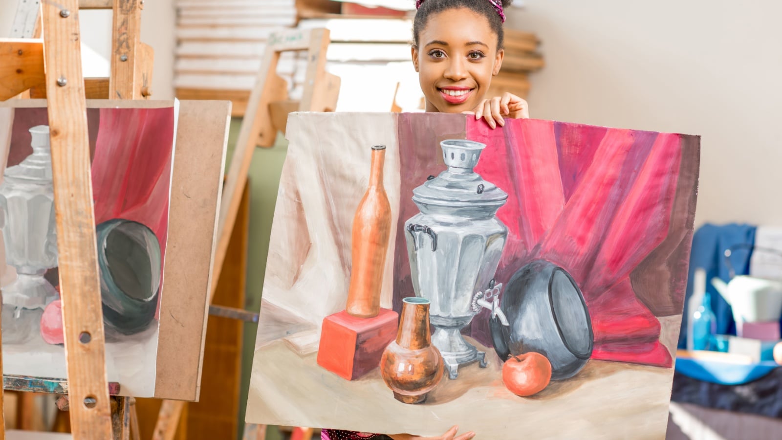
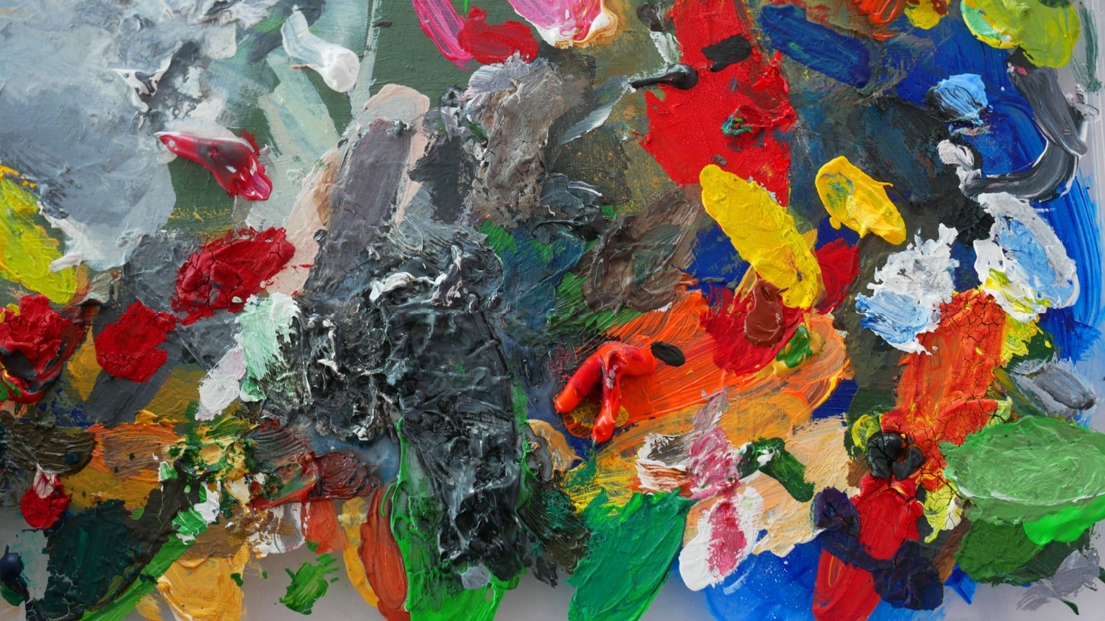
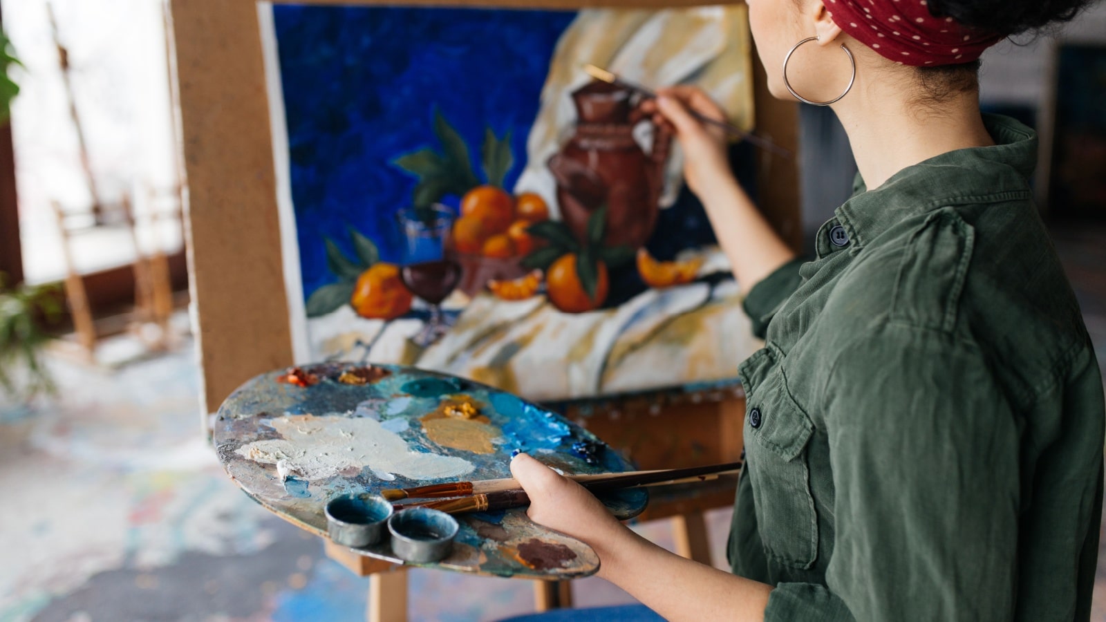
Lysenko Andrii via Shutterstock.com.
We won’t teach you how to hold a brush or use a palette knife to create texture. There are thousands of technical details which change from person to person.
The real lesson isn’t learning the mechanical skills; it’s learning how to SEE. Our still-life painting techniques show you what skilled artists pay attention to. You’ll start to view color and light, tone and form, texture and depth like a master. These painting techniques will help beginners master the art.
Once you learn how to see it, you can use whatever mechanical techniques you like.
Here, we outline six still-life painting techniques to help bring your artwork to the next level. Of course, they aren’t the only things your painting needs, but these key components will help you push your work to even greater depth and dimension.
Once you master them in still-life, you can use them to move on to landscape, portraiture, figurative, or even abstract work.
Light and Color – Techniques 1 and 2
Light and color are the most essential components of a still-life painting.
The simplest still lifes showcase the relationship between light and color, portraying how one object, which seems to be a single shade throughout, looks different depending on how the light reaches it.
If your still-life setup doesn’t showcase the dynamic interplay between light and color, your painting won’t, either.
Why the Relationship between Light and Color Matters
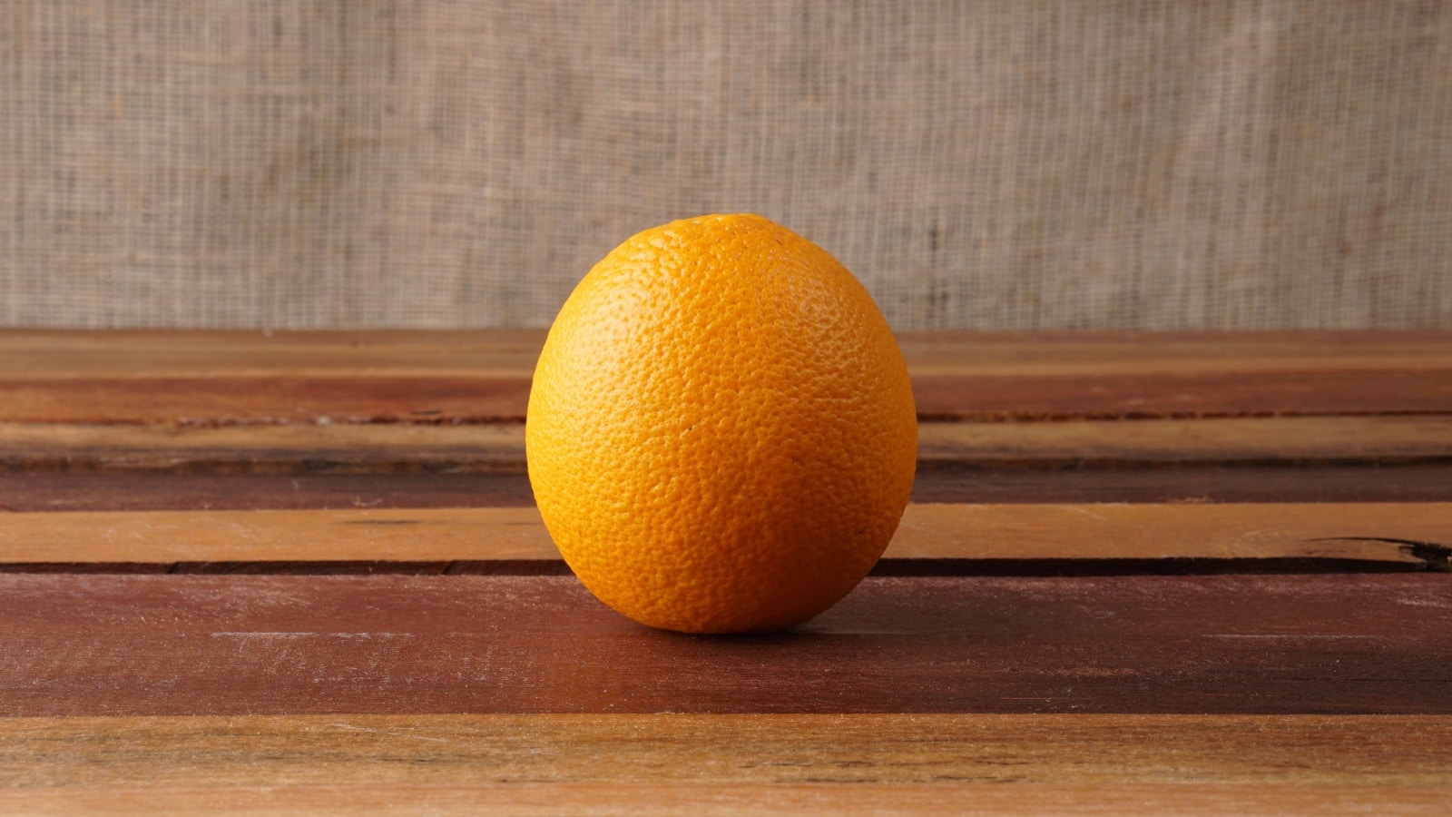
To be a successful artist, you need to learn the interplay between light and color. Look at how an orange looks so bright and brilliant where the light hits it but neutralizes to an almost gray color in the darkest shadows. Learn to replicate that dynamic in your art.
They’re two sides to the same coin, yet the art instruction world likes to divide them in half. It’s a a clever way of looking at light because it allows you to appreciate the relationships between dark and light and warm and cool.
While you can look at the world in one or the other, value or color, they’re inseparable when it comes to reality, and thus realism, and thus in your still-life painting.
How to Manage the Relationship between Light and Color in Your Painting

We inherently know the difference between light and dark. A study of impressionist pioneers will teach us that when the light is warm, the shadows appear dark and cool; when the light is cool, the shadows will appear warm and dark.
They showed us these concepts in their work, expressing their shadows with lavender and violet on hot summer days, regardless of how dark the shadows looked in reality.
By now, your intuition should have kicked in, and you realize that you must manage light and color as two interrelated binary relationships.
It’s not as complicated as it sounds. I’ll help you break it down into a manageable blueprint.
Designing Your Light-to-Dark, Warm-to-Cool Color Palettes
At the absolute minimum, you must choose two distinct colors that will only be used on one side of the light/shadow relationship.
For example, if you have warm sunlight, candlelight, or reflected light, take your red, yellow, or orange and only use that color in the lightest zones.
Then, find a cool color, such as blue, green, or purple, and relegate that color only to the shadows. Now that you’ve chosen where your painting divides, establish the lights and darks with any colors you feel fit the scenario, always keeping your two original tones separated.
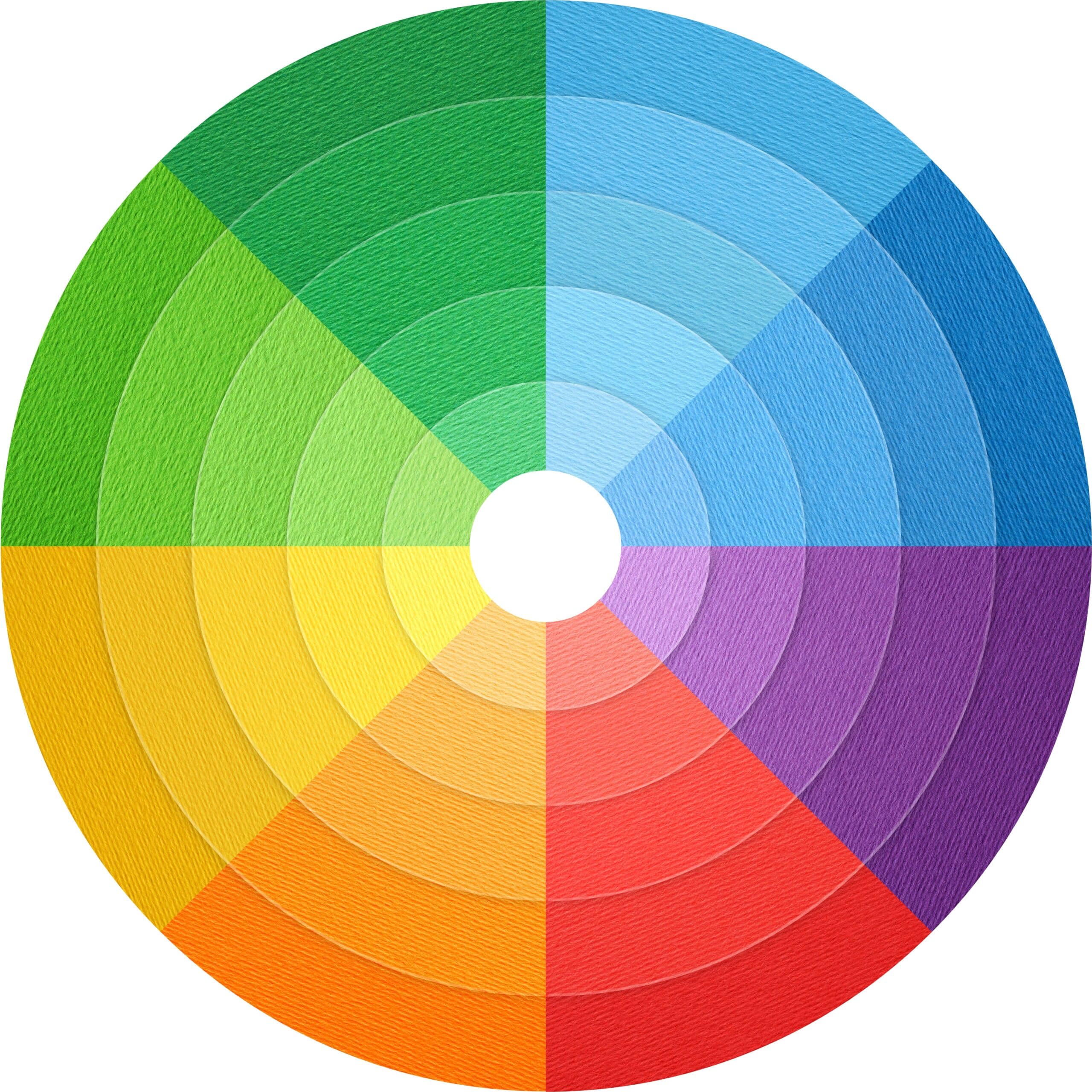
Research color theory if you need help determining which colors to focus on. Then, reference your color wheel to find complementary and contrasting colors.
Creating Contrasts
Creating contrast doesn’t only apply to colors on the wheel. It applies to the painting as a whole.
There will be a point in your still-life painting where the two mutually exclusive color pigments meet. At this division between light and shadow, the eye will see the highest contrast between light and dark and between warm and cool, thereby breaking light and color into its four distinct components at that point of intersection.
If you create these contrasts, you will have accomplished something that rings true to the natural behavior of light, creating more realism in your image.
Where Light Meets Matter

Light and color don’t happen on their own. They don’t exist until they run into something.
We see the light and color of our sun during the day, but at night, it disappears. When we look at the night sky, we see the stars but realize that most of space is filled with infinite darkness.
There’s light from stars, but it has nothing to shine upon.
When light hits something, like the sun hitting the Earth, it fragments into its components – the visible light spectrum that colors our world.
The light creates the beauty that you’re replicating on canvas.
Developing a Color/Value Strategy
To replicate the complex interplay between light and dark, map out your color/value strategy. It’s a straightforward still-life painting technique that will prepare you to paint any object.
Assign your lowest five values to the shadows and your lightest five to the brightest areas. From there, it’s just a matter of remembering to balance how light or dark your values are with the color temperature you find in your environment.
It still sounds complex, but the colors you use barely matter if your values are correct. Just keep in mind how color and temperature work in tandem with value to tell a story about how light behaves in the scene.
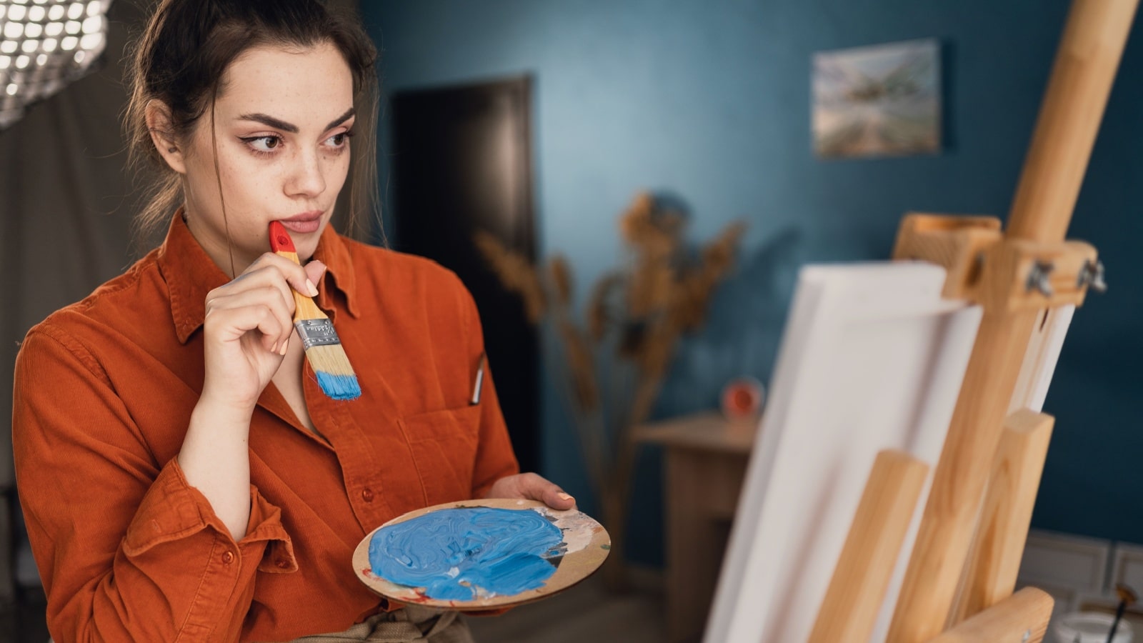
Form and Tone – Techniques 3 and 4
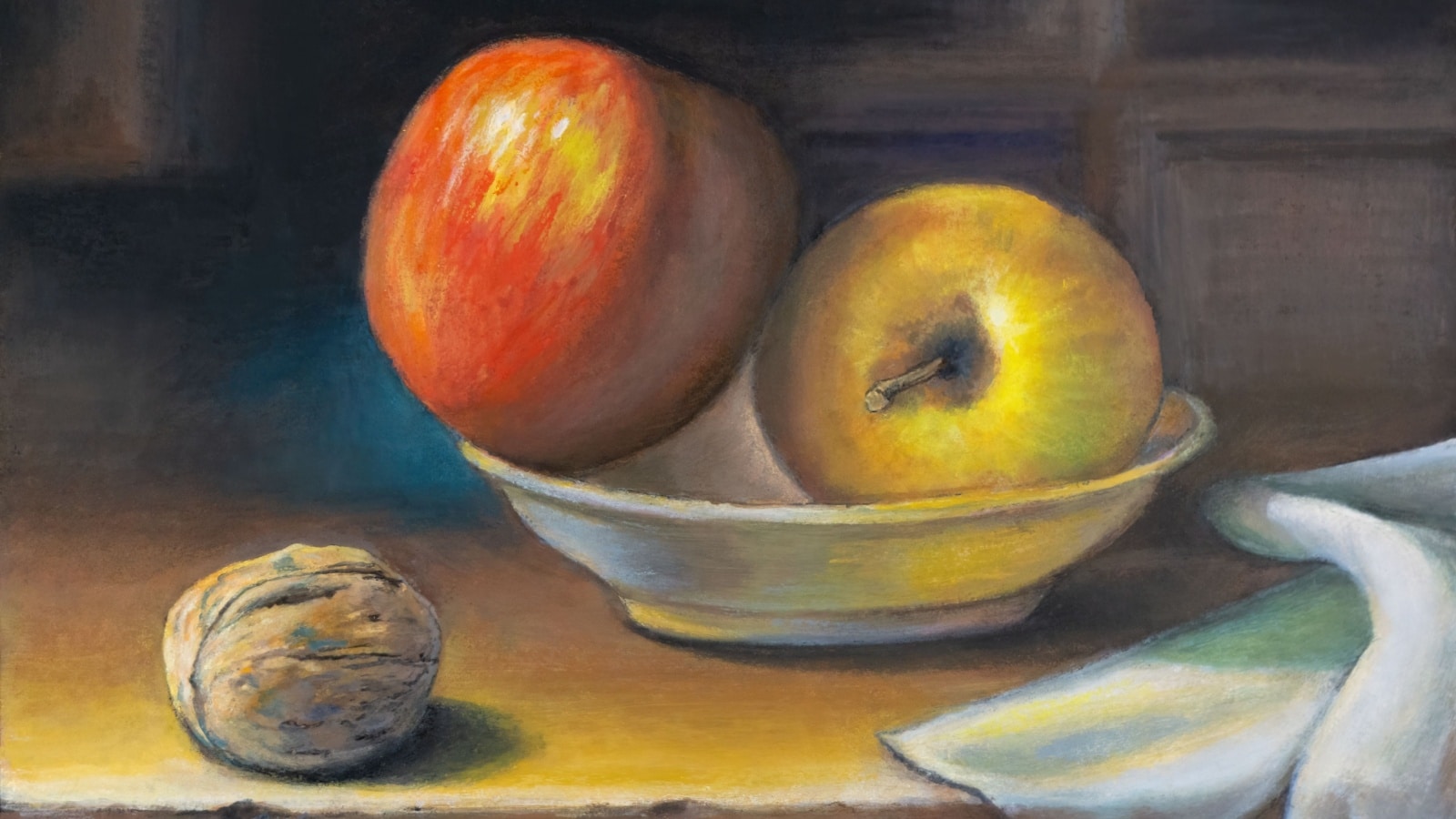
Andrea Danti via Shutterstock.com.
We spent a lot of time on light and color but didn’t discuss the still life itself.
Still-life painting techniques 3 and 4 address the form and tone of your painting. They refer to interesting gradations of light and the balance of bright lights with dynamic contrast, which helps us understand the visual aesthetic.
Imagine a cube on the table beside a sphere of equal size. While the cube may express volume, the sphere has form.
The sphere’s shape has a turning quality, exposing and hiding itself simultaneously. At any point on its surface, it represents form by both coming forward and falling away.
Interesting forms give light something to play with, and with a careful variety of objects, light can be shown off on these forms and the resulting color tones as light is reflected back at the observer.
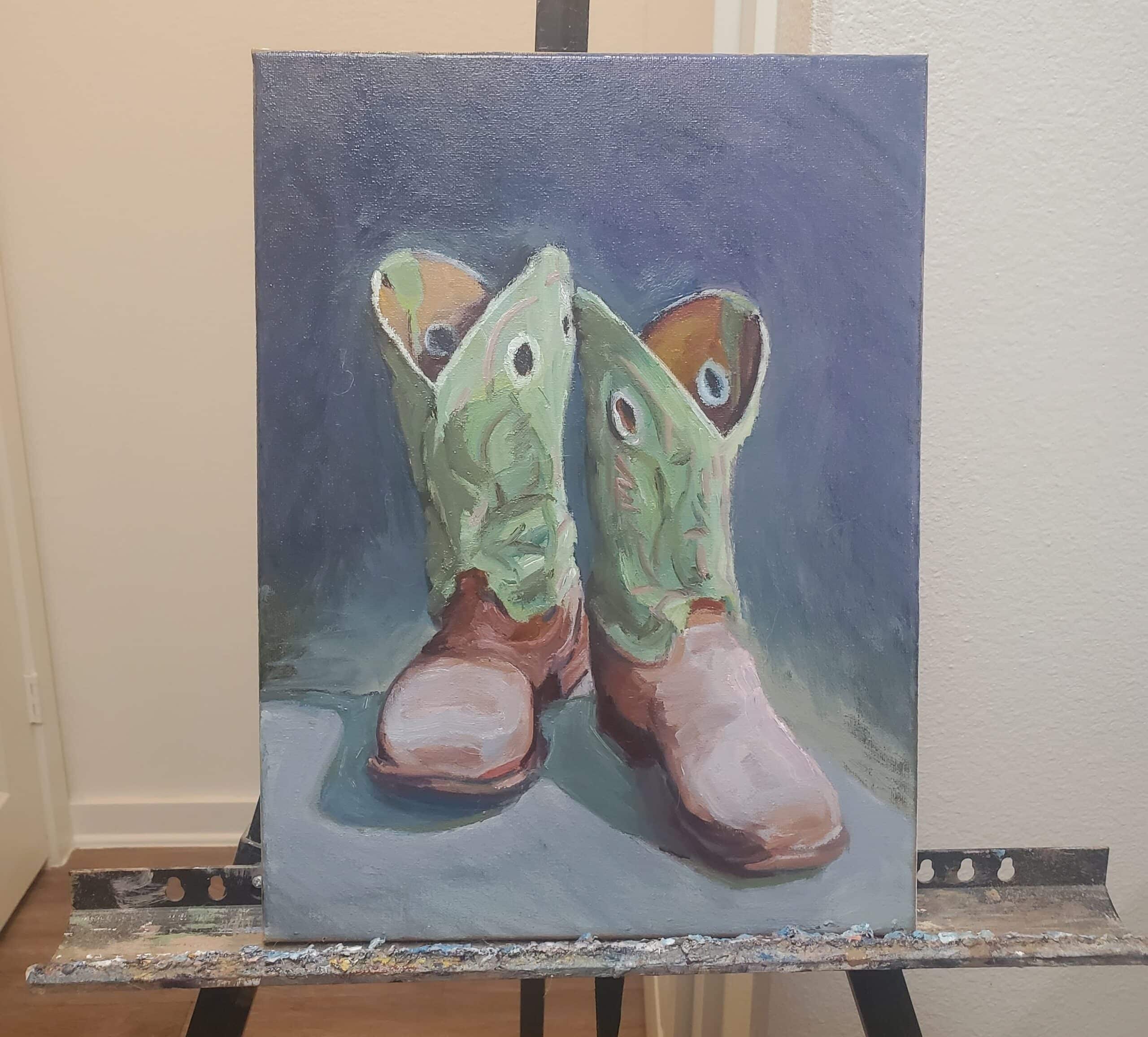
For example, look at the unique form of the boots. The variety of shapes (circles, cylinders, cones, and ellipses) keep the eye moving around the work, making something interesting out of what most would consider mundane.
Texture and Depth – Techniques 5 & 6
These last two still-life painting techniques are pretty straightforward. You must choose objects with contrasting textures and balance the depth of your still life by pushing some objects into the background.
Beginners may want to start with just one object, like a fruit, to master the techniques with color and light. You will notice how it ties into light and dark, as the fruit will be lighter in the foreground and darker in the background (depending on where you place your light source).
Next, experiment with texture and depth. What does the fruit feel like? Is it scaly, like a lemon, or smooth, like an apple? How can you represent that feeling on canvas?
Texture brings objects to life, while depth gives the impression that your painting is three-dimensional, making it more lifelike.
Start with something simple, like a bouquet of flowers.
The flowers in the background will give it depth, and the various flower types, components, and the vase itself offer different textures for you to experiment with.
Putting It All Together
To create a spectacular still life, you must master techniques related to light, color, form, tone, texture, and depth.
Keep in mind that we’re talking about contrast and differences in each of these categories. Set up your light source so that your subjects and their shadows create an interesting contrast. Include objects with color-planning in mind, and balance those saturated color tones around your still-life setup.
Choose objects with interesting forms as well. With every change, step back and check your still life for a balance of color tones. Try not to overwhelm your painting with too-vibrant color tones.
Select items with varying textures, some smooth and some rough, and look for ways to mimic those textures with paint.
Finally, ensure some objects receive less light by being pushed to the back of your still life. It’s key to keeping your still life painting from coming off 2-dimensionally.
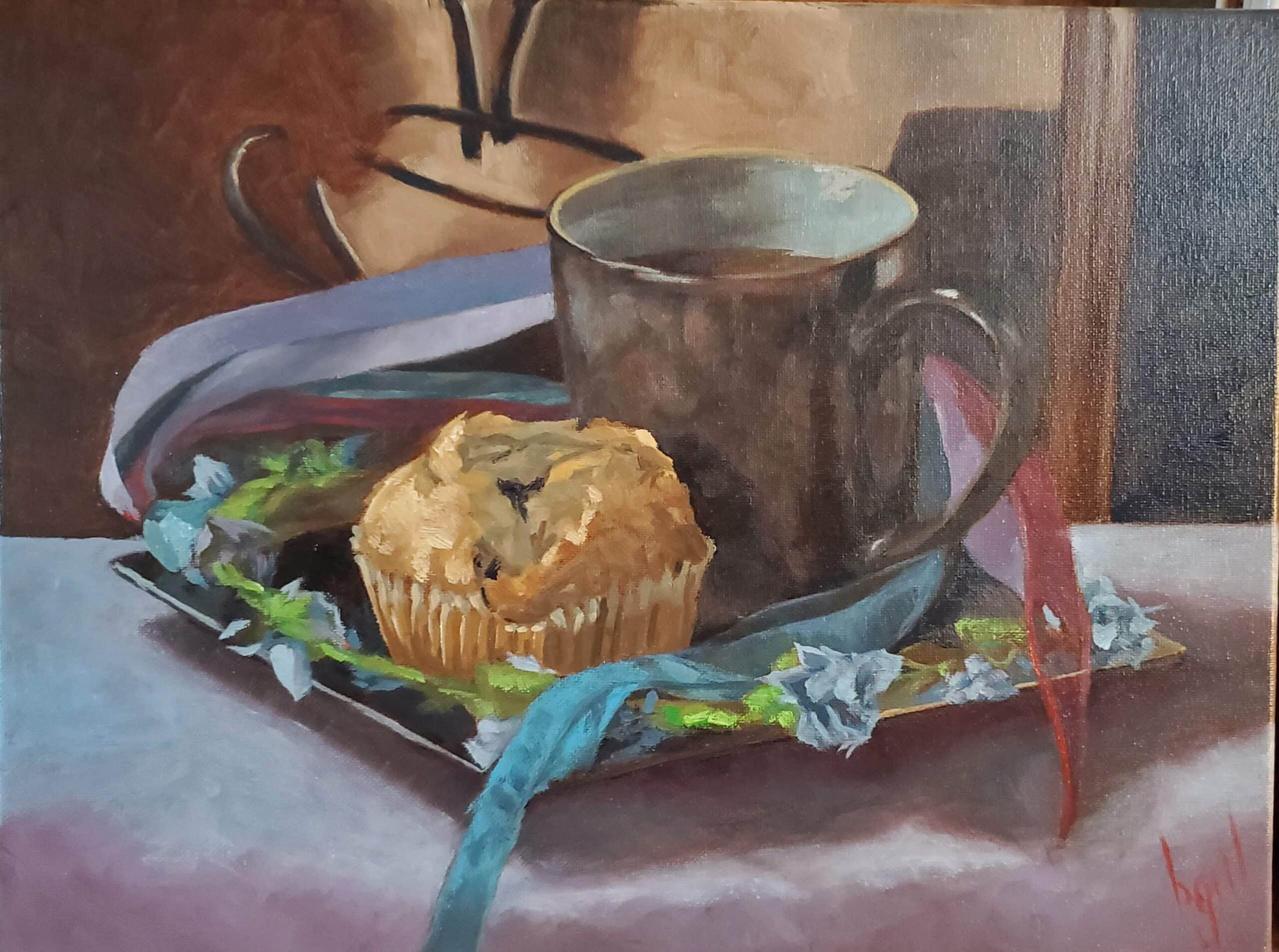
For example, in the painting below, we have warm oranges and browns in the mug and background contrasted with cool blues in the ribbon and foreground. We have various textures, like the smooth ceramic of a coffee cup and the rough surface of a muffin. The varied forms offer another contrast, with the sharp edges of the plate complimenting the soft turn of the ribbon and the crisp circles in the shapes.
Bonus Technique: Give Your Still-Life a Personal Touch
Once you understand them, you can experiment, using them loosely to create your own vision, a unique work of art that is unarguably yours.
Because there is only one true rule in the art world: If you can’t do something no one else has, do it in a way only you can do. It is the broadest of artist statements meant to allow a terrifying amount of freedom.
Materials for Your Still-Life

Now that you understand the crucial still-life painting techniques let’s take a second to talk about mediums and materials.
You can create a still life using any medium, from watercolor to acrylics. If you want, you can also just use a pencil or charcoal to draw a still life.
Your canvas will be different depending on the type of paint you choose. For example, you shouldn’t use watercolor paper for painting with acrylics. Each medium also requires special paintbrushes. You should be well versed in your chosen media and the specific materials needed for working in that media.
The only notable things you need to create your still life are an object or scene to paint and a light source.
You could use a desk lamp to create a warmer scene or just sunlight to create a natural scene. Nearly anything you find in your house will work. A fruit, a teacup, knickknacks, candles, or anything set upon a table or desk will do.
Creating Your Still-Life Masterpiece
Mastering these techniques will not only make you a better still-life painter but also help you with figure painting, landscape painting, portrait painting, and any other type of artistic expression that you choose to explore.
Learning to paint still life is how you learn to paint everything else. So use these techniques, master them, and then come back for ideas about what else you should paint!
Great lesson. Great advice
.